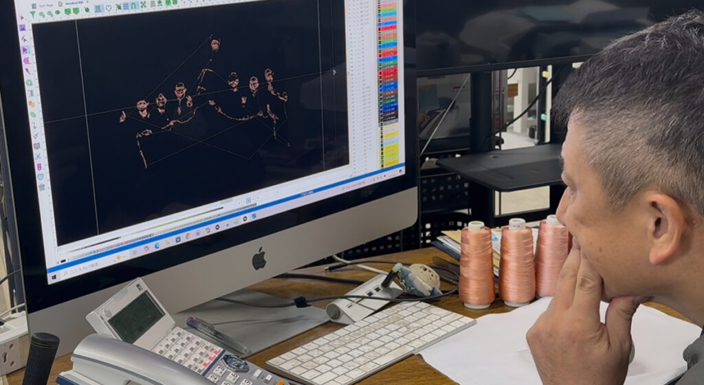
Thread color matching is one of the most difficult parts of photo embroidery for me. While embroidery software can automatically assign colors, I’ve found that trusting my own eyes leads to better results.
In my process, I always compare the original image, the embroidery data on the screen, and the actual threads in hand. I don’t choose just one color for a skin tone. Instead, I lay out all the related tones and carefully select the ones that blend well together—avoiding sharp contrast or unnatural shifts in hue.
Brightness is just as important as color itself. Every stitch should flow smoothly into the next, creating a natural gradient that mimics light and shadow.
But even with careful selection, I can never be completely sure until the embroidery is stitched. That’s why I make many different kinds of photo embroidery pieces—to train my senses and improve my understanding of color behavior in thread.
Another key element is the thread list. I regularly update it to reflect new colors and remove those that no longer suit my style. Keeping it current helps me make faster, more accurate choices.
And perhaps most importantly, I constantly link what I see in everyday life to embroidery threads. When I see a sunset or a shadow on a face, I instinctively think, “That looks like thread number 117!” It’s not a deliberate exercise anymore—it’s just how I see the world now, thanks to years of experience with photo embroidery.